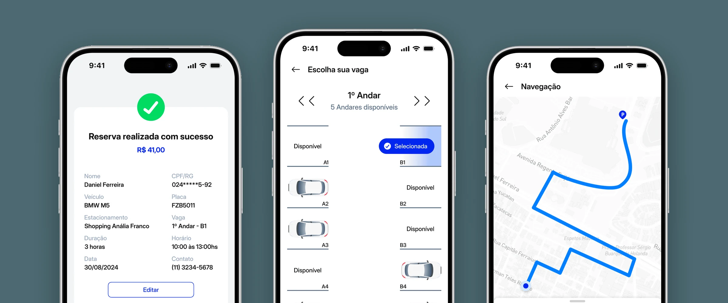
StopCar books the exact spot your car will sit in, and walks you there.
The hackathon theme was Vertical Smart Cities. We picked parking because everyone in the room had lived the problem. Research showed us we did not actually understand it.
There were three of us. I ran the research, the flows, the interface and the pitch.
The problem was not finding a spot, it was fear
Eleven people answered. Seven park every day, and not one of them said finding a spot was ever easy. But the thing that came up most was not scarcity:
"The risk of coming back and not finding the car."
Eight of the eleven answers about frustration talk about fear, theft or safety. The problem was not parking fast. It was leaving the car alone.
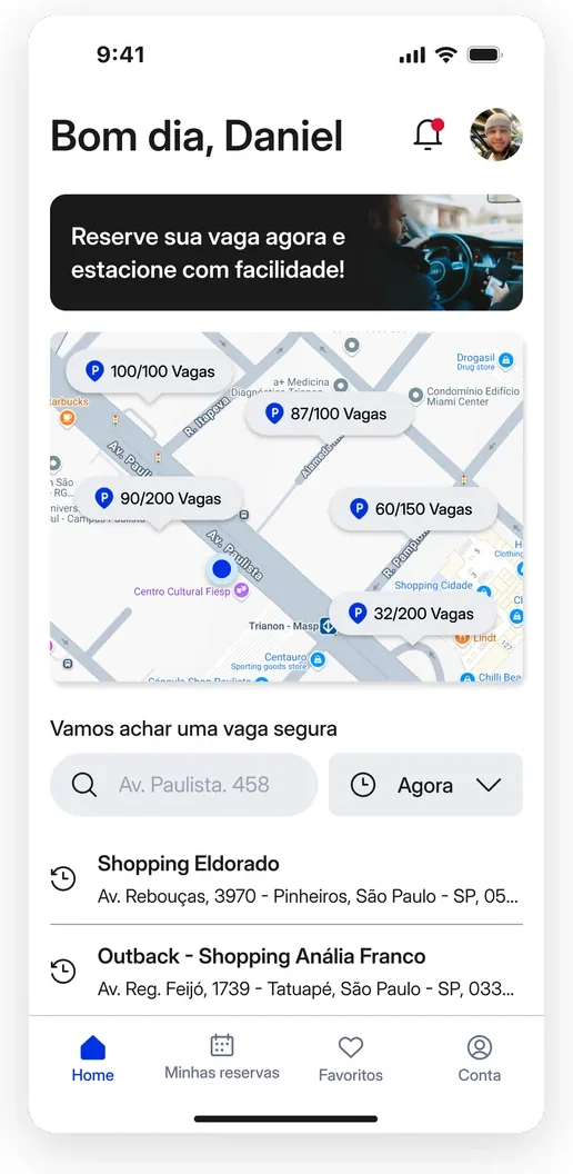 The home screen answers both findings: the map shows live availability, and the search line talks about a safe spot.
Three decisions that came out of the research
Two front doors. Someone already on the street needs this solved in seconds; someone leaving home in three hours wants to compare. The entry splits, and the paths meet again further down.
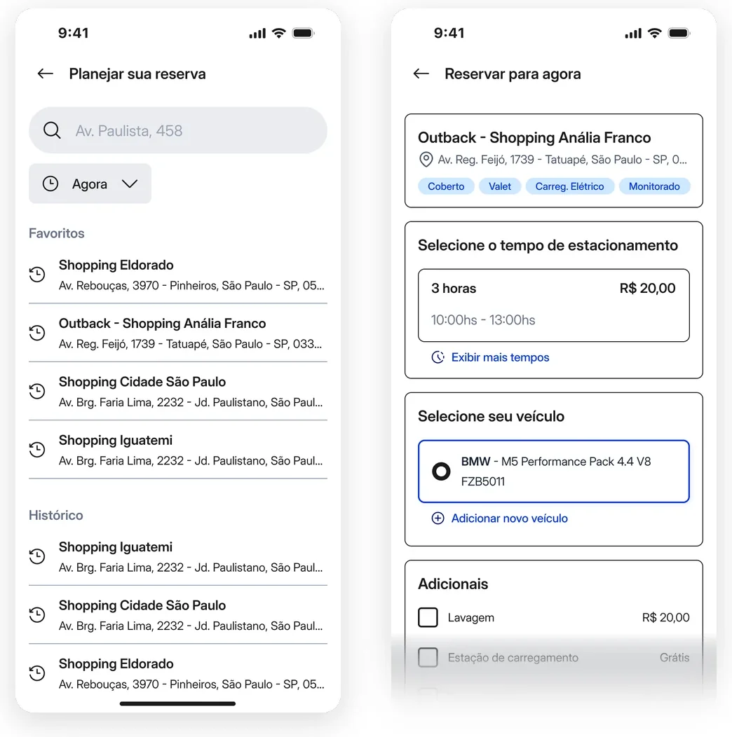 The same booking, two different beginnings.
A spot has an address. Nobody knew the category, so the barrier was not learning the app, it was trusting it. The choice goes all the way down to one specific spot, which in this garage means a floor and a number.
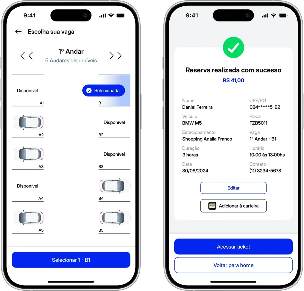 This is how the product answers the theme: verticality as a decision, not as a word in the brief.
It does not end at payment. Confirming does not finish the task. You still have to arrive, get in, and sometimes stay longer than planned.
Start the trip and let on-screen navigation take you there.
The product existed to take insecurity away. Stopping at the payment screen would have contradicted that.
First place, and the thing I had missed
The jury called out how new the proposal was.
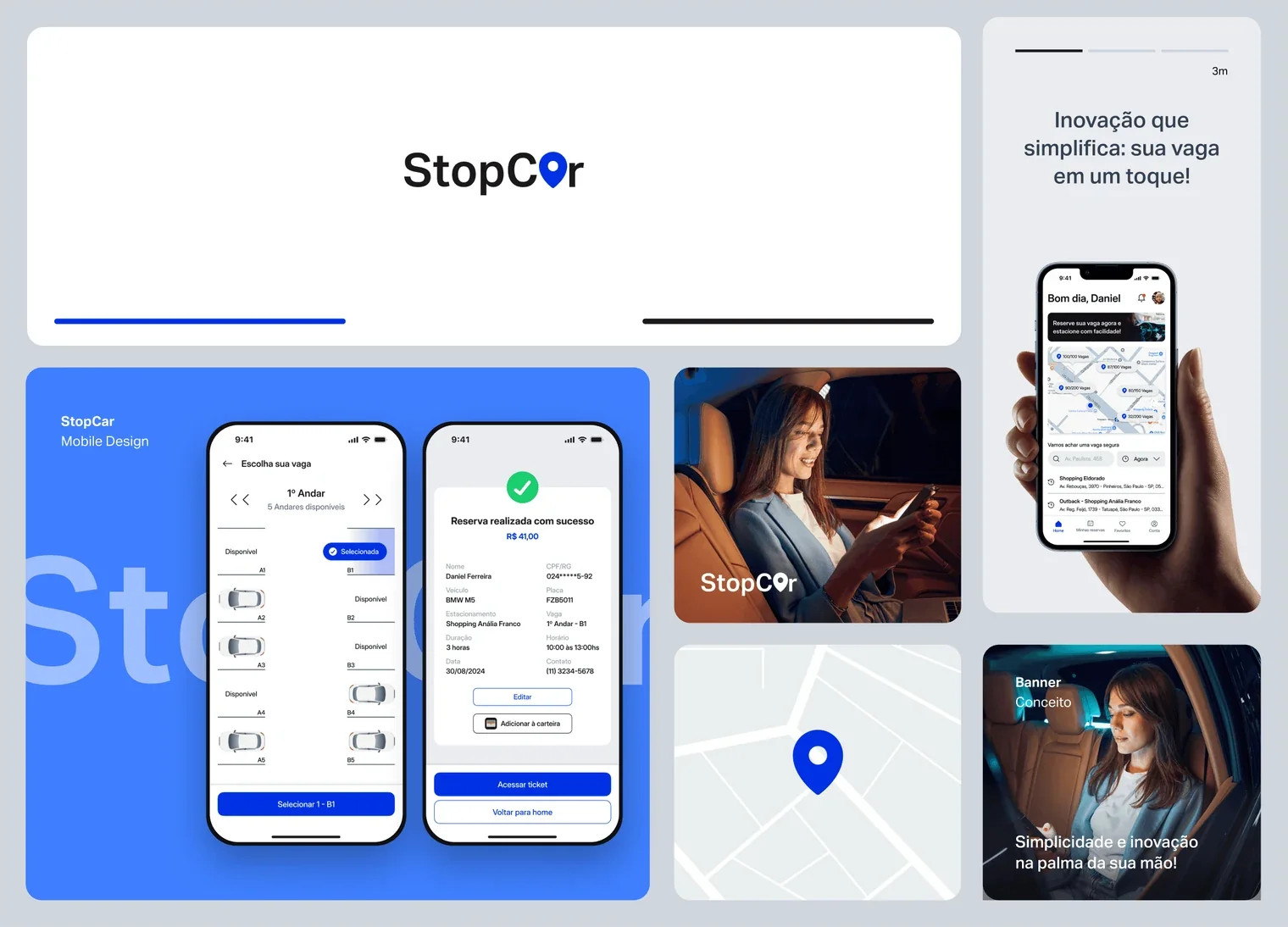 The board that went to the jury: brand, product and positioning in a single composition.
I came back to the project in 2024 and found what taught me the most: I had collected the research and never synthesised it. The decisions were right by well-informed instinct, not by reasoning I could audit later.